Buttons
-
Create a function to handle the button:
-
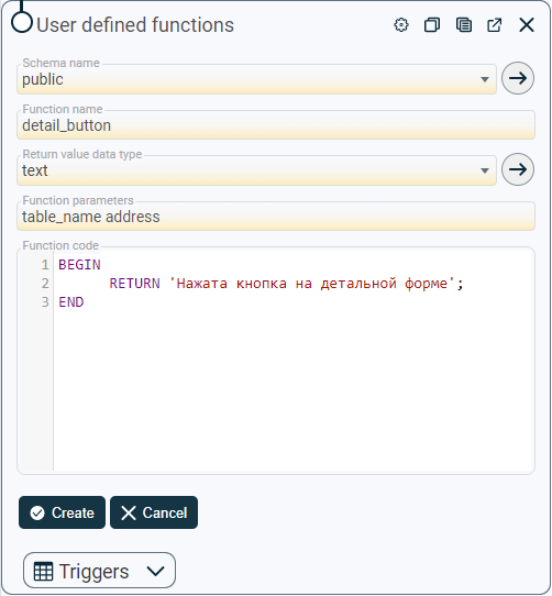
Go to
 [Menu] > [Configuration] > [User defined functions].
 -
Click the button
 [Add…] in tabular form.
 -
Fill in the required fields: “Schema name”, “Function name”, “Return value data type”, “Function parameters”, “Function code”. Description of all fields in User defined functions.
Use an object of the same type as the table as the input parameter of the function.
For example:
CREATE OR REPLACE FUNCTION detail_button(address)
  RETURNS text AS
$BODY$
BEGIN
  RETURN 'Нажата кнопка на детальной форме';
END
$BODY$
  LANGUAGE plpgsql VOLATILE SECURITY DEFINER
  COST 100;
- Click the button
 [Create] to add an entry or a button
  [Cancel] to exit the add mode without saving data.
-
-
Create a button:
-
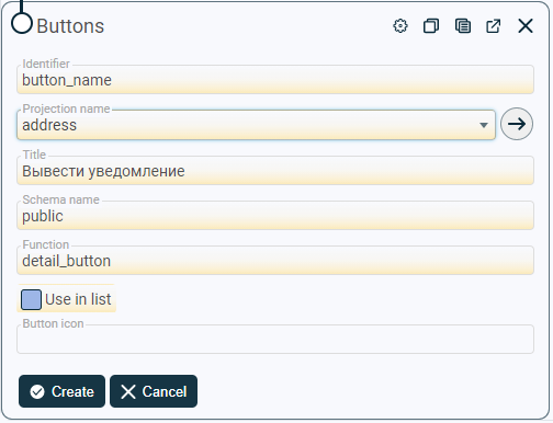
Go to
[Menu] > [Configuration] > [Buttons] (or [Selected entity] > button  [More] > the button
  [Setup…] > the container
  [Buttons]).
 -
Click the button
[Add…] in tabular form. -
Fill in the required fields: “Identifier”, “Projection name”, “Schema name”, “Function”, *“Use in list” * in the value “false”. Description of all fields in Buttons.
-
Click the button
[Create] to add an entry or a button [Cancel] to exit the add mode without saving data.
-
-
Create a function to handle the button:
-
Go to
[Menu] > [Configuration] > [User-defined functions]. -
Click the button
[Add…] in tabular form. -
Fill in the required fields: “Schema name”, “Function name”, “Return value data type”,“Function Parameters”, “Function Code”. Description of all fields in User-defined functions.
As the input parameter of the function, use an array of the same type as the primary key.
Например:
CREATE OR REPLACE FUNCTION table_button(text[])
  RETURNS text AS
$BODY$
BEGIN
  RETURN 'Нажата кнопка в табличной форме';
END
$BODY$
  LANGUAGE plpgsql VOLATILE SECURITY DEFINER
  COST 100;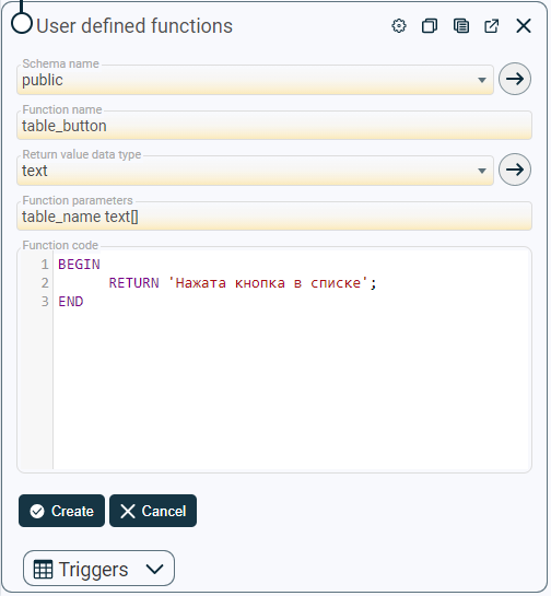
-
Click the button
[Create] to add an entry or a button [Cancel] to exit the add mode without saving data.
-
-
Create a button:
- Go to [Menu] > [Configuration] > [Buttons] (or [Selected entity] > button [More] > the button [Setup…] > the container [Buttons]).
- Go to
-
Click the button
[Add…] in tabular form. -
Fill in the required fields: “Identifier”, “Projection name”, “Schema name”, “Function”, “Use in list” in the value “true”. Description of all fields in Buttons.
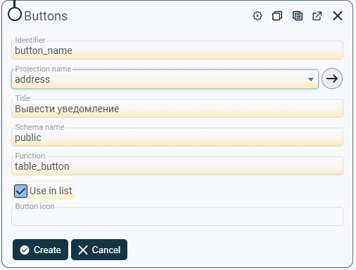
- Click the button [Create] to add an entry or a button [Cancel] to exit the add mode without saving data.
Hiding and displaying the buttons: “Save”, “Add”, “Delete”.
-
Go to [Selected entity] > button
[More] > the button [Setup…]. -
In the detailed form, click
 [Edit] to switch to edit mode.
 -
Enter in the field “Additional parameters” :
{ "button_visible": { "save": "condition", "add": "condition", "delete": "condition" } } -
Вместо Instead of “condition”, enter the value/expression for which the corresponding button should be displayed on the detailed form. Set several conditions for one button (if necessary):
{
  "button_visible": {
    "delete": [
      {
        "field": "b1",
        "op": "EQ",
        "value": "c1"
      },
      {
        "field": "b2",
        "op": "EQ",
        "value": "c2"
      }
    ],
...
  }
}
The conditions are combined by the “AND” operation.
The field “field” contains the name of the field, the value of which is used to identify the position of the button.
The “op” field contains the operation to be performed. The values in this field can be:
- “EQ” - is equal to;
- “NEQ” - not equal to;
- “ISN” - is equal to 0;
- “ISNN” - not equal to 0;
- “ANY” - is included in the array of values of the “value"field. At the same time, in the “value” field, it is necessary to list the values, if one of them matches, the condition will be fulfilled. For example:
     ...
     "op": "ANY",
           "value": [
             "\"char\"",
             "character",
             "character varying",
             "bit",
             "bit varying"
           ]
     ...
Operator support is expected:
- “G” - more;
- “F” - calling a function with the name corresponding to the value in the “field” field;
- “FC” - is a special parameter for internal use. It is not used in this manual;
- “EQF” - compares the value from the” field “field with the value from the” value “field;
- “FEQ” - a special parameter for internal use. It is not used in this manual;
- “L” - less;
- “GEQ” - greater than or equal to;
- “LEQ” - less than or equal to;
- “C” - occurrence of the substring;
The “value” field contains the value at which the condition will be met.
-
Instead of a, b and c, enter:
- instead of “a” - the name of the field (not the header) for which the check should be performed;
- instead of “b” - an operation, when the condition is met, the button will be displayed;
- instead of “c” - the value that will be used by the operation as a border.
If there are several buttons that need to be hidden/displayed, then the lines are listed separated by commas inside the “button_visible” element.
-
Click the button
[Save] to save changes or click [Cancel] to exit the edit mode without saving.
Hiding and displaying the buttons: “Save”, “Add”, “Delete” on the tabular and detailed form at the same time.
-
Go to [Selected entity] > button
[More] > the button [Setup…]. -
In the detailed form, click
[Edit] to switch to edit mode. -
Enter in the field “Additional parameters” :
{
  "viewActions": {
    "allowAdd": false,
    "allowDelete": false,
    "allowSave": true
  }
}
The value “true” is to display the button.
The value “false” is to hide the button.
-
Click the button
[Save] to save changes or click [Cancel] to exit the edit mode without saving.
The “Save”, “Add”, “Delete” buttons can be active or inactive when certain conditions are met.
-
Go to [Selected entity] > button
[More] > the button [Setup…]. -
In the detailed form, click
[Edit] to switch to edit mode. -
Enter in the field “Additional parameters” :
{ "button_enabled": { "save": "condition", "add": "condition", "delete": "condition" } } -
Instead of “condition”, enter the value/expression at which the corresponding button will be active. Set several conditions for one button (if necessary):
{
  "button_enabled": {
    "delete": [
      {
        "field": "b1",
        "op": "EQ",
        "value": "c1"
      },
      {
        "field": "b2",
        "op": "EQ",
        "value": "c2"
      }
    ],
...
  }
}
The conditions are combined by the “AND” operation.
The field “field” contains the name of the field, the value of which is used to identify the status of the button.
The “op” field contains the operation to be performed. The values in this field can be:
-
“EQ” is equal to;
-
“NEQ” - not equal to;
-
“G” - more;
-
“- “F” - calling a function with the name corresponding to the value in the “field"field;
-
“FC” is a special parameter for internal use. It is not used in this manual;
-
“EQF” - compares the value from the “field” field with the value from the “value"field;
-
“FEQ” is a special parameter for internal use. It is not used in this manual;
-
“L” - less;
-
“GEQ” - greater than or equal to;
-
“LEQ” - less than or equal to;
-
“C” - occurrence of the substring;
-
“ISN” - is equal to 0;
-
“ISNN” - is not equal to 0.
The “value” field contains the value at which the condition.
-
-
Instead of a, b and c, enter:
- instead of “a” - the name of the field (not the header) for which the check should be performed;
- instead of “b” - an operation, when the condition is met, the button will be active;
- instead of “c” - the value that will be used by the operation as a border.
If there are several buttons for which conditions need to be set, then the lines are listed separated by commas inside the “button_enabled” element.
-
Click the button
[Save] to save changes or click [Cancel] to exit the edit mode without saving.
The drop-down list is supplemented with link buttons:
- the button
 opens a form for adding values to the drop-down list.
 - the button
 opens an additional form associated with the selected drop-down list item.
-
Go to [Selected entity] > button
[More] > the button [Setup…]. -
In the detailed form, click
[Edit] to switch to edit mode. -
Enter in the field “Additional parameters” :
{ "hideRefToDetail": "a" } -
Instead of “a”, specify “true” or “false” to allow or prohibit the display of the element, respectively.
By default, the function has the value “false”.
-
Click the button
[Save] to save changes or click [Cancel] to exit the edit mode without saving.

A group of radio buttons is used to select one option from a group of mutually exclusive options.
-
Add a new column to the entity (see more details in Adding a column). In the field “Type on display”, select the value “radiobutton”.
-
Go to [Selected entity] > button
[More] > button [Setup…]. -
In the detailed form, click
[Edit] to switch to edit mode. -
Specify the parameters:
Method 1:
-
Enter in the field “Additional parameters” :
{
  "source-items": [
    "a1",
    "a2",
   ...
  ],
  "use-enumeration": "true"
}
The “source-items” field contains a set of button headers.
-
Instead of a1, a2, enter the button headers.
-
Specify “use-enumeration” (if necessary). The field “use-enumeration”, set to “true”, saves the index of the selected element to the database: 1, 2, 3, etc.
By default, “use-enumeration” has the value “false”.
Method 2:
-
Enter in the field “Additional parameters” :
{
  "source-dictionary": [
    {
      "key": "b1",
      "value": "c1"
    },
    {
      "key": "b2",
      "value": "c2"
    },
   ...
  ]
}
The “source-dictionary” field contains a set of keys and button headers.
-
Instead of b1, b2 and c1 c2, enter:
- instead of “b1”, “b2” - values that will be entered into the database;
- instead of “c1”, “c2” - button headers.
-
-
Specify “null-option” (if necessary):
{
   ...
   "null-option": "not specified"
   ...
}
The “null-option” field contains the button title. Clicking on the button will assign the value “null"to the group of radio buttons.
-
Specify “columnOptions” (if necessary):
{
   ...
   "columnOptions": "1"
   ...
}
The “columnOptions” field contains the number of columns when displaying a group of radio buttons. Supported values are: 0 - in a row, 1, 2, 3.
- Click the button [Save] to save changes or click [Cancel] to exit the edit mode without saving.
By default, contextual actions are located in the “More” panel. This function allows you to set the location for contextual actions in the main window.
-
Go to [Selected entity] > button
[More] > the button [Setup…]. -
In the detailed form, click
[Edit] to switch to edit mode. -
Enter in the field “Additional parameters” :
{
  "actionsFilter": {
    "a": "main"
  }
}
Instead of a, specify for which context action to change the location to the main window:
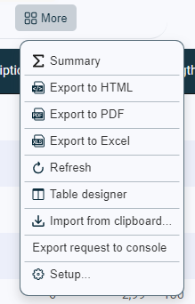
Contextual action Description showTableFilter  [Filter]
showTableSummary  [Summary]
exportToHtml  [Export to HTML]
exportToPdf  [Export to PDF]
exportToExcel  [Export to Excel]
report [Report…] reload  [Refresh]
showConstructor  [Table designer]
openPivot [Analyze…] importFromClipboard  [Import from clipboard]
editVersions [Export request to console] settings [Setup] -
Click the button
[Save] to save changes or click [Cancel] to exit the edit mode without saving.